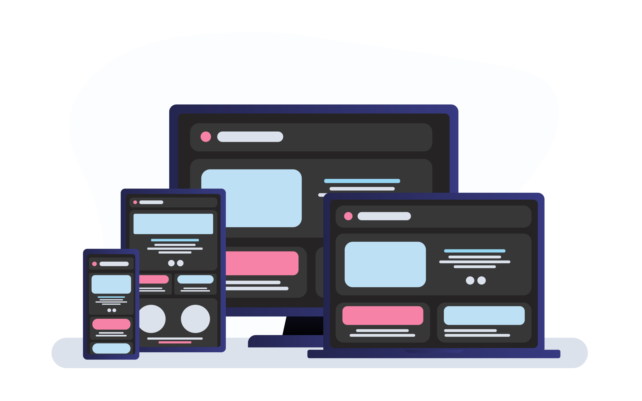
A new design trend has taken center stage, capturing the attention of both designers and users alike: dark mode. Over recent years, this once niche design choice has blossomed into a mainstream feature, sought by many and incorporated across numerous platforms and applications.
Dark mode's unique aesthetics, combined with its potential user experience benefits, have positioned it as a go-to option in the sphere of contemporary website design. From software applications to websites, the allure of this theme is undeniable, promising not just style but also functionality.
Why Website Dark Mode?
For contemporary website design, the adoption of dark mode isn't just a fleeting trend. It brings with it a multitude of advantages, making it a favoured choice among web designers, web developers, and users alike.
Benefits of Dark Mode in Design
- Aesthetic Appeal
Dark mode offers a fresh, modern look that can accentuate design elements, making them pop. This can enhance visual hierarchy and draw the user's attention to crucial information or calls to action. - Enhanced Readability
For many users, light text on a dark background can be easier on the eyes, especially in low-light conditions. This can lead to improved content absorption and longer on-site durations. - Reduced Blue Light Exposure
Dark mode emits less blue light than its light-themed counterpart. Reduced blue light exposure, especially during the evening, can minimize disruptions to the user's sleep cycle.
Conserving Energy and Reducing Eye Strain
- Energy Efficiency
On OLED and AMOLED screens, displaying black means turning off individual pixels. This results in energy savings, which can contribute to longer battery life for devices like smartphones and laptops. - Comfort in Dim Settings
Dark mode is often favored in low-light environments, such as during nighttime browsing. It minimizes the glare that can result from a bright screen, leading to a more comfortable viewing experience. - Decreased Eye Fatigue
Prolonged exposure to bright screens can lead to digital eye strain, characterized by symptoms like dry eyes, headaches, and blurred vision. Dark mode can mitigate these effects by offering a softer visual experience.
The Aesthetics of Darkness
The allure of dark mode isn't merely rooted in its benefits for eye comfort or energy conservation. At its core, dark mode offers an entirely different aesthetic experience that can evoke specific emotions, establish brand personas, and provide a distinct backdrop for content presentation.
How Dark Mode Sets a Mood
- Depth and Sophistication
Dark backgrounds often convey a sense of depth and luxury. Brands aiming for an upscale or sophisticated image might find dark mode particularly aligned with their branding goals. - Highlighting Critical Elements
The inherent contrast in dark mode means essential elements, such as call-to-action buttons or highlighted information, can stand out more vividly, grabbing the user's attention. - Evoking Emotion
Colours influence emotions. A dark mode can evoke feelings of calm, serenity, or even mystery, making the browsing experience more immersive and emotionally engaging.
Picking the Right Colour Schemes
- Beyond Pure Black
While many associate dark mode with black, there's a spectrum of dark shades to explore. Charcoal, navy, or even deep purples can be used as background colours to add nuance and prevent the design from feeling too stark. - Harmonizing Accent Colours
When working with a dark canvas, accent colours should be chosen judiciously. Soft pastels, metallic shades, or even bright neons can work harmoniously with a dark background when used sparingly and strategically. - Ensuring Readability
Whichever colour scheme you pick, it's essential to ensure that text remains legible. This often means choosing light, neutral shades for primary content, ensuring that the contrast ratio remains comfortable for extended reading. - Consistency Across Elements
Remember to harmonize the chosen colour palette across all elements, from buttons to hyperlinks, to ensure a cohesive browsing experience.
Contrast is Key
When working with dark modes, contrast is not just a design consideration—it's a crucial element that affects usability, accessibility, and overall user experience.
Importance of Maintaining a Balanced Contrast Ratio
- Readability and Legibility
A good contrast ensures that the text is legible against its background. Without proper contrast, users may struggle to understand content, leading to a decline in user satisfaction and potentially website traffic. - Accessibility for All
A balanced contrast ratio ensures that individuals with visual impairments, including conditions like colour blindness, can access and comprehend the website's content. It's not just about aesthetics; it's about inclusivity. - Enhanced User Engagement
Users are more likely to stay on and interact with a website where content is easily discernible. High contrast ratios in the right areas can also guide users' attention to essential elements like CTAs or crucial information. - Preventing User Fatigue
Especially in dark mode, where the overall luminance is low, insufficient contrast can cause eye strain as users try to discern text or elements, leading to faster fatigue and reduced browsing time.
Tools to Help Measure and Adjust
- WebAIM Contrast Checker
This online tool allows designers to input foreground and background colours to check if they meet the recommended contrast ratios for web accessibility. - ColorZilla
An extension for Chrome and Firefox, ColorZilla includes a colour picker tool and a gradient generator, but its standout feature is the ability to analyze page colours and determine if they have adequate contrast. - Contrast Ratio
A simple online tool, it enables designers to quickly gauge the contrast ratio between two colours, offering instant feedback on whether the combination is suitable. - Contrast Grid
For those working with a variety of colour combinations across a site, this tool checks a matrix of foreground and background colours to identify any combinations that fall below the acceptable contrast ratio.
While the aesthetics of dark mode are undoubtedly compelling, it's imperative to prioritize a balanced contrast ratio. By doing so, designers ensure a positive, accessible, and engaging user experience, making the website both beautiful and functional.
Optimized Imagery for Dark Themes
Dark-themed websites exude sophistication and modernity, but they also present unique challenges, especially when it comes to selecting and displaying imagery. Ensuring your images and icons don't just look good but also function optimally on dark backgrounds is crucial for the overall user experience. Below is how to pick the right visuals and adjust them for dark themes:
Picking Images and Icons Suitable for Dark Backgrounds
- High-Contrast Imagery
Images with a higher contrast, where subjects stand out clearly against their backgrounds, generally pop better on dark themes. - Lighter Foregrounds
Images with lighter subjects or main elements will naturally be more visible against a dark backdrop. - Avoid Dark Edges
Images with dark borders or fringes might blend into the background, making them look out of place or unintentionally cropped. - Icon Considerations
For icons, it's best to opt for white or light-coloured outlines. Filled icons can also work if they have a dominant light shade.
Adjusting Visuals with CSS Filters and SVG Masks
- CSS Filters for Image Enhancement
- Brightness and Contrast: By subtly increasing an image’s brightness and tweaking its contrast using
filter: brightness(1.1) contrast(1.05);, you can ensure it stands out against a dark background without looking washed out. - Saturation: Sometimes, increasing the colour saturation can make an image more vibrant and compatible with dark themes. This can be achieved using
filter: saturate(1.2);.
- Brightness and Contrast: By subtly increasing an image’s brightness and tweaking its contrast using
- SVG Masks for Icons and Shapes
SVG masks are a powerful way to manipulate the visibility of an image or icon. By defining a mask that pairs with your dark theme, you can ensure icons and graphics display optimally. For instance, if you have a dark icon, a mask can be used to invert its colour, making it suitable for a dark backdrop. - Blend Modes
While a more advanced technique, using CSS blend modes likemix-blend-mode: difference;can automatically adjust image or icon colours based on the underlying background. This is especially useful when the background colour can change, ensuring the foreground element remains visible.
It’s vital to ensure that the imagery used complements and enhances this design choice. Through careful selection and the right adjustments, designers can create a cohesive, engaging, and user-friendly dark-themed site.
Let Users Choose: Switching Modes
One size doesn't always fit all, especially in web design. As the appeal of dark themes grows, it's essential to remember that not every user might be on board with this design choice.
Offering flexibility in the form of mode switching has become a hallmark of user-friendly design.
Importance of Giving Users the Choice
- User Comfort
Everyone has unique visual preferences. While some find dark mode easier on the eyes, especially in low-light environments, others might feel the opposite, finding light themes more readable. - Accessibility
Users with specific visual impairments or sensitivities might find one theme more comfortable than the other. Offering a choice ensures you cater to a broader range of accessibility needs. - Battery Consumption
On devices with OLED or AMOLED screens, dark mode can lead to battery savings. However, giving the choice allows users to prioritize their preferences, whether it’s aesthetics or battery life. - Respecting User Autonomy
Letting users customize their experience, even in something as seemingly minor as a theme choice, enhances their sense of control and satisfaction with your platform.
Implementing Easy Toggles and Auto-Detection Methods
- Visible Toggle Button
Place a clear and easily accessible toggle button, preferably in the form of a sun/moon icon or a switch, in prominent areas like the header or navigation bar. This allows users to switch between modes seamlessly. - Using prefers-colour-scheme
The CSS media featureprefers-colour-schemelets you detect if the user has set their system to use a light or dark colour scheme. With this, you can automatically set your website's theme to align with the user's system settings upon their first visit. - Remember User Preferences
Utilizing cookies or local storage ensures that returning visitors don’t have to reset their preferred theme every time they revisit your website. - Smooth Transitions
When users switch between themes, adding a subtle transition effect can make the shift feel more seamless and less jarring. - Feedback Loop
Include a small feedback prompt for users who toggle between themes. This can offer insights into their preferences and reasons for their choices, helping you further refine your design approach.
Perfecting the Dark Design
Like any other design choice, the effectiveness of a dark theme doesn't rest solely on its implementation. The real challenge lies in fine-tuning it to perfection. An excellent dark mode design requires iteration, feedback, and meticulous attention to ensure consistency and user satisfaction.
Testing Designs Across Devices and Lighting Conditions
- Device Diversity
Dark mode might appear differently on various devices, from mobile phones to desktops, and even different browser types. It's essential to test the design across a range of devices to ensure a uniform experience. - Lighting Variations
A dark theme might look perfect under the dim light of your work station but could be less impressive under the bright sunlight. Conduct tests in varied lighting conditions to ascertain the theme's effectiveness and adaptability.
Gathering Feedback for Continuous Refinement
- User Surveys
Regularly collect feedback from your users about their experience with the dark mode on your site. This will provide invaluable insights that can guide your refinements. - Analytics
Monitor user behaviour. Are there fewer bounces with the dark mode activated? Do users spend more time on your site when using dark mode? Such metrics can give you an objective measure of the dark theme's effectiveness. - Peer Review
Sometimes, a fresh pair of eyes can spot inconsistencies or areas of improvement that you might have overlooked. Encourage peer reviews for constructive feedback.
The surge in the popularity of website dark mode isn't just a passing trend. Its rise signifies a shift towards designs that prioritize user comfort, energy conservation, and a unique aesthetic appeal. While dark mode brings a slew of benefits, its success lies in its meticulous design, continuous testing, and an unwavering commitment to user feedback.
Whether it's heightened user engagement, reduced bounce rates, or simply offering a visually appealing platform, the advantages of a well-implemented dark mode are too significant to ignore.