Web design, at its core, is a harmonious blend of creativity, technology, and collaboration. Both the client and the designer play a part bringing a vision to life on the screen. By ensuring you provide the necessary elements to your web designer, you can significantly enhance the fluidity of the design process and the quality of the final product.
It's not just about speeding up the project; it's about setting the stage for excellence. The right materials can bridge the gap between expectation and realization, ensuring that the final website mirrors the envisioned concept while delivering optimal performance.
Clarity on Your Brand Identity
A strong brand identity is the backbone of any successful website. It's the visual and emotional cue that connects users to your brand's values, products, or services.
To assist your web designer in truly capturing the essence of your brand, it's essential to provide them with detailed insights into your brand identity.
Logo and Brand Guidelines
Your logo is often the first visual element users identify with, making it a crucial component of your brand's digital presence. When handing it over to your web designer, supply it in a high-resolution or vector format to ensure scalability.
If you have specific brand guidelines or a style guide, share it. This document provides an overarching view of how your brand should be represented, from logo placements and variations to the correct use of imagery and more. By adhering to these guidelines, you maintain brand consistency, ensuring that visitors have a uniform experience, whether they're viewing a digital ad, a social media post, or your website.
Brand Colours and Fonts
Colours and fonts play a vital role in evoking emotions and guiding user actions. They need to remain consistent to strengthen brand recall and enhance user experience.
Share the exact colour codes (like RGB, CMYK, or HEX values) you use in your branding. This ensures that the website's colours align perfectly with other brand materials.
Specify primary and secondary fonts, along with any backup or web-safe fonts you'd like to be used. If there's a specific licensing for any proprietary font, ensure your web designer is aware.
If possible, provide examples of where and how certain fonts and colours should be used. For instance, you might have a specific font just for headings or a particular shade reserved for call-to-action buttons.
Ensuring a cohesive look across platforms means your audience will have a unified and memorable experience, no matter where they interact with your brand. By offering clarity on your brand identity, you empower your web designer to create a site that stands as a true digital extension of your brand ethos.
Content is King
The foundation of every impactful website is its content. While design elements set the mood and ambiance, it's the content that conveys the message, interacts with the audience, and drives action.
For a web designer, having access to the right content not only streamlines the design process but also helps ensure the final output aligns with your brand's vision.
Pre-written Web Copy
Words are powerful. They inform, persuade, and engage your audience. When you provide pre-written content to your web designer, it helps them understand the narrative flow, enabling them to design layouts that complement your message.
Tailored content ensures that the design is molded around the message, rather than forcing the message into a predefined design. This often results in a more organic and harmonious webpage.
Clear, concise, and well-structured content can aid in determining navigation structure, call-to-action placements, and even the visual elements that would best accentuate the text.
While it's possible to adjust content to fit a design, starting with strong web copy ensures the design amplifies the message rather than diluting or overshadowing it.
High-Quality Images and Graphics
Visuals breathe life into a website. They captivate attention, elucidate complex concepts, and enhance the overall aesthetic appeal. However, there's an art to integrating them effectively.
High-resolution images are crucial for modern displays, ensuring clarity and sharpness. Yet, it's essential to strike a balance between image quality and file size, as bulky files can slow down your site.
- Provide images in their original size and format. This allows the web designer to optimize and scale them appropriately for various devices and screen sizes.
- Inform your designer if certain graphics or images have licensing or attribution requirements. This ensures compliance and avoids potential copyright issues.
Whenever possible, use original photographs or custom graphics. Stock images, while convenient, can be generic. Custom visuals resonate better with audiences and set your website apart from competitors.
Incorporating high-quality content and visuals is pivotal in making your website both engaging and professional. By supplying your web designer with these essentials, you're laying the groundwork for a site that's not just beautiful, but also meaningful and effective.
Functionality and Features
Beyond the visual appeal and content, the functionality of a website is the driving force behind user interactions and conversions. It's the difference between a website that's merely a digital brochure and one that's an interactive hub for your audience.
Clearly communicating the features you desire and providing examples can offer your web designer a roadmap to meet your objectives more accurately.
List of Desired Features
Every website serves a purpose, and the features it includes should align with that purpose. Here's why providing a comprehensive list is essential:
- Purpose-Driven Design
Whether it's a contact form for lead generation, a blog for content marketing, or e-commerce functionalities for online sales, specifying your desired features ensures your website is tailored to meet its primary objectives. - Prioritization
By listing out features, your designer can prioritize them based on their importance, ensuring critical functionalities are given prominence in the design. - Integration
Some features, like newsletter sign-ups or booking systems, may require third-party integrations. Knowing these in advance helps the designer choose the best tools and plugins for seamless integration.
Examples of Websites You Admire
While it's crucial for your website to be unique, drawing inspiration from others can be incredibly beneficial. Here’s how sharing websites you admire can assist:
- Visual Blueprint
Even with detailed descriptions, visualizing a concept can be subjective. Providing examples offers your designer a tangible reference to your preferences. - Benchmarking
Analyzing commendable websites can give insights into best practices, latest trends, and effective strategies, ensuring your site is at par with or better than industry standards. - Efficiency
Understanding your vision reduces the back-and-forth, making the design process smoother and more efficient. It narrows down the aesthetic and functional choices, reducing potential revisions.
Being clear about your desired functionalities and features, coupled with providing inspirational references, empowers your web designer to create a platform that’s not just visually pleasing but also functionally robust and aligned with your vision.
Understanding the Target Audience
Every website should be built with its end user in mind. To design a website that resonates and provides value, understanding who the target audience is becomes paramount. By providing your web designer with insights into your audience, you ensure that the website is strategically crafted to address their needs, preferences, and behaviours.
User Personas
User personas represent the different types of users who will interact with your website. They are fictional, yet realistic, profiles of your ideal customers. By providing these to your web designer, you can achieve:
- Custom-Tailored Design
By knowing who the users are, their needs, and their pain points, designers can craft elements that directly appeal to them. - Effective Communication
Different personas have varied ways they prefer to consume content. Whether it's through infographics, video, or detailed articles, understanding personas ensures content is delivered in the most effective format. - Increased Engagement
A design that speaks to its users will naturally engage them better, encouraging them to explore more, stay longer, and interact more deeply with the website.
Desired User Journey/Experience
The user journey is the path a user takes through your website, from the first page they land on to the final action they take, be it a purchase, sign-up, or other conversion. Outlining this journey for your designer ensures:
- Streamlined Navigation
When the desired user path is clear, a designer can optimize the site's navigation to make that journey as intuitive and straightforward as possible. - Focused Content Placement
Knowing the user journey allows for strategic placement of calls to action, offers, and vital information at the right points to facilitate conversions. - Reduction in Drop-offs
By providing a clear and easy-to-follow user journey, you reduce the chances of users getting frustrated or lost, thus decreasing bounce rates.
In a nutshell, when your web designer has a clear understanding of your audience and the experience you wish to offer them, the design becomes more than just about aesthetics. It transforms into a strategic tool that guides users, engages them, and leads them to the desired outcomes.
Any Existing Web Assets
In the process of crafting a new website or revamping an old one, making use of existing web assets can provide invaluable insights and save considerable time. These assets can act as a foundation upon which improvements can be built. By providing your web designer with access to these assets, you facilitate a smoother transition and an informed design process.
Current Website Access (if any)
If you're looking for a website redesign or planning on migrating to a new platform, granting access to your current site can offer several benefits:
- Understanding the Base
A designer can better gauge the magnitude of changes required by examining the existing design, content, and structure. - Content Retrieval
For redesigns, it's efficient to pull existing content, imagery, or design elements that remain relevant and can be incorporated into the new design. - Seamless Migration
By having direct access, technical hurdles associated with migration, such as URL structures, redirects, or existing integrations, can be handled adeptly.
Analytics and Performance Data
Your existing website's analytics data is a goldmine of information, revealing how your users interact with your site. Here's why it's invaluable to the design process:
- User Behaviour Insights
By analyzing which pages users spend the most time on, where they drop off, or the paths they often take, designers can optimize the layout and user journey for better engagement. - Performance Assessment
Understanding elements like page load times, server response times, and other technical metrics can guide the design process to avoid past pitfalls and improve site performance. - Conversion Data
Knowing which CTAs or pages have high or low conversion rates can aid in making informed design choices that boost overall conversions.
When a web designer is armed with existing assets and data, they're better positioned to create a website that isn't just visually appealing but also performs optimally. Existing assets serve as both a reference point and a foundation, streamlining the design and development phases.
Timelines and Deadlines
In the realm of web design, as in any project-based endeavor, time is of the essence. An effective timeline not only sets expectations but also ensures the smooth progression of tasks, resulting in a successful project completion.
When clients and web designers are aligned on timelines and deadlines, it fosters a positive working environment and minimizes the potential for miscommunication or delays.
Clarity on Project Milestones
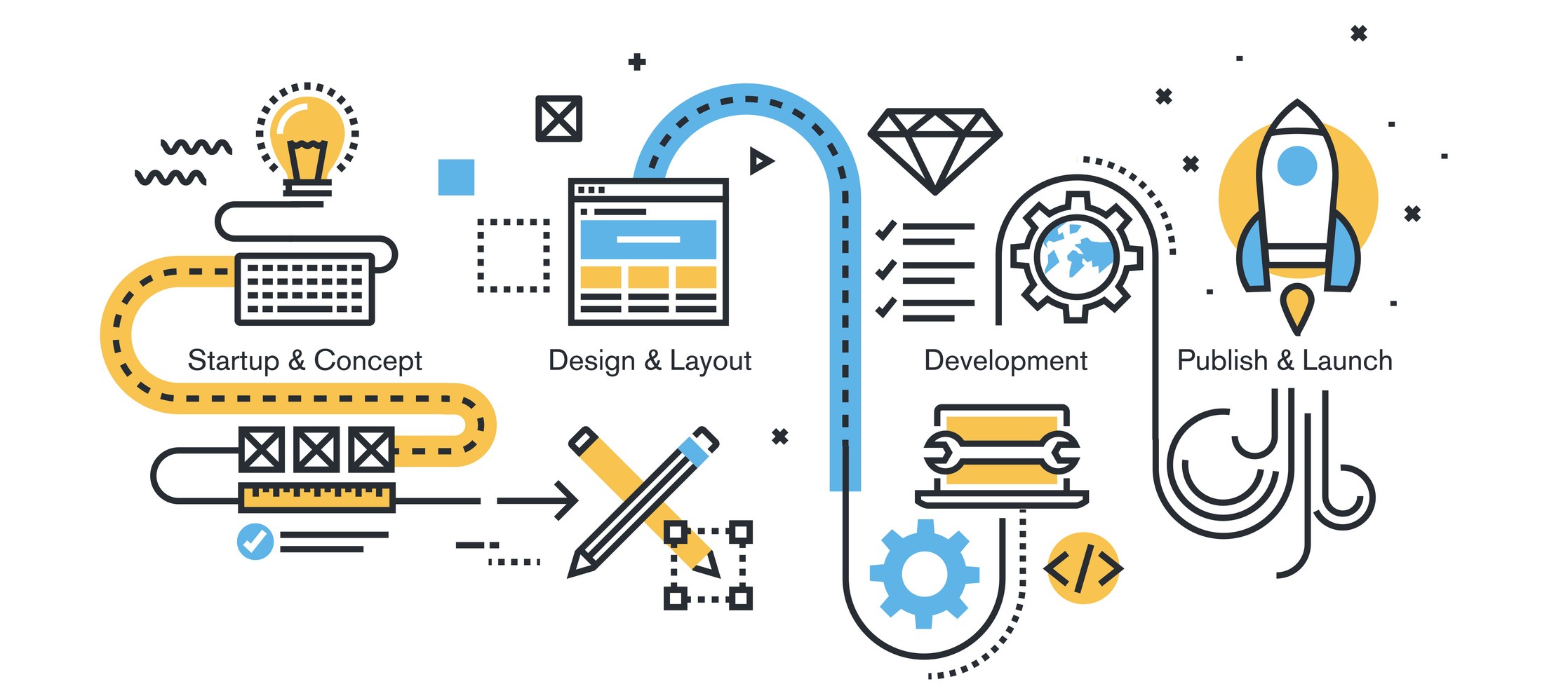
Every web design project comprises several stages - from initial conceptualization to the final deployment. Clarifying the milestones helps in multiple ways:
- Structured Progress
It helps both the client and the designer understand the project's phased progression. This might include stages like ideation, wireframing, design mockups, development, testing, and launch. - Feedback Loops
By establishing clear milestones, you can also set checkpoints for feedback, ensuring that the design aligns with your vision and making adjustments before proceeding further. - Resource Allocation
Knowing what's coming up can help designers manage their time better, allocate resources, or even bring in specialists if a particular milestone demands it.
Understanding Potential Constraints
Every project can face unforeseen challenges. These could be resource-related, technical, or even external factors. Having a candid discussion about potential constraints can be beneficial:
- Risk Mitigation
When a web designer is aware of possible roadblocks, they can plan for contingencies, ensuring the project remains on track. - Setting Realistic Expectations
It's essential to recognize that some desired features might be time-intensive or might face technical constraints. An open dialogue ensures that all parties are aligned in their expectations. - Flexibility in Adjustments
If either party anticipates potential delays – be it due to content provision, feedback loops, or development complexities – adjustments can be made to the timeline early on, preventing last-minute rushes or compromises in quality.
Clear communication about timelines and understanding potential constraints are foundational to a successful web design project. It helps keep both the client and the designer on the same page, ensuring a harmonious collaboration and a timely project completion.
Your Budget
While everyone desires a world-class website, understanding and communicating your budget is paramount. This doesn’t mean cutting corners, but rather ensuring that every dollar spent yields the maximum value. Transparency about budget aids in fostering a relationship built on trust and understanding between you and your web designer.
Importance of Open Dialogue
Being candid about your financial limitations and expectations isn’t just practical; it's essential for several reasons:
- Tailored Solutions
With a clear budget, designers can propose solutions that deliver maximum impact without overstepping financial boundaries. This might involve prioritizing certain features, suggesting alternative tools, or optimizing the design process. - Avoiding Scope Creep
Open discussions about the budget can help set the scope of the project from the outset, ensuring that both parties have aligned expectations and preventing unplanned expenses down the road. - Efficient Resource Utilization
Knowing the budget helps designers allocate resources effectively, ensuring that time and expertise are directed towards aspects that provide the most value for your project.
Finding Value Within Constraints
A defined budget is not a constraint but an opportunity to innovate. Here’s how a transparent budget can lead to value-driven solutions:
- Strategic Prioritization
Not all features are created equal. By understanding your budget, a web designer can prioritize features that resonate most with your target audience or goals. - Cost-Effective Alternatives
In the vast world of web design tools and technologies, there are often multiple ways to achieve a goal. A clear budget allows designers to recommend alternative solutions that are both effective and budget-friendly. - Planning for the Future
If certain desired features or functionalities exceed the current budget, they can be planned as part of a future phase or update, ensuring that the website can evolve and scale as funds become available.
A transparent budget is not just about numbers; it's about setting the stage for a successful collaboration. By being forthright about your budget, you enable your web designer to craft solutions that resonate with your vision while respecting your financial boundaries. The end result? A website that delivers value, meets your goals, and stays within the set budget.
Feedback Mechanism
Establishing a clear and efficient feedback mechanism with your web designer ensures that the design process is iterative, collaborative, and aligned with your vision.
Regular Check-ins
Scheduling regular check-ins is beneficial for both parties involved. Here's why:
- Alignment with Vision
These meetings serve as checkpoints to ensure the design remains in line with the original concept and goals. - Timely Revisions
Spotting potential issues or discrepancies early on makes the revision process smoother and more efficient. - Progress Tracking
Regular updates provide a clear picture of where the project stands and what to anticipate in the upcoming stages.
Maintaining Open Communication Lines
While scheduled check-ins are essential, spontaneous communication is equally vital for a successful project outcome:
- Clarity and Understanding
Immediate feedback fosters better understanding, reducing the chances of misinterpretations or prolonged back-and-forths. - Flexibility
Open communication allows for quicker pivots if new ideas emerge or if certain elements need reevaluation. - Building Trust
A transparent and ongoing dialogue nurtures a sense of trust, fostering a stronger partnership between you and your web designer.
Navigating the journey of web design requires more than just creativity and technical prowess. It's a collaboration that thrives on preparation, clear communication, and a shared vision. By equipping your web designer with the right tools, information, and feedback, you not only streamline the design process but also ensure the final product resonates with your brand's essence.


