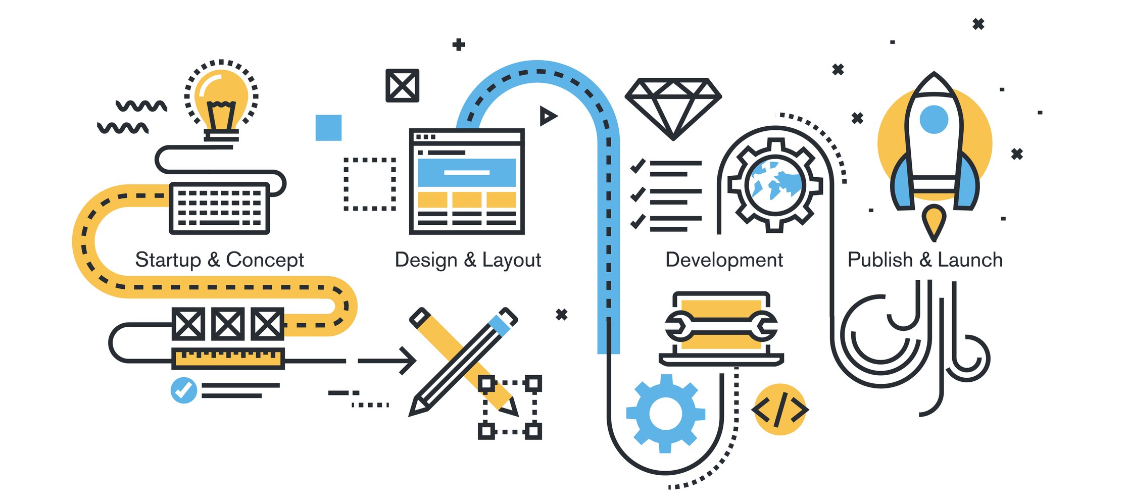
Building a website is an essential part of establishing an online presence for businesses, organizations, and individuals. However, creating a website that looks professional, functions well, and achieves its intended goals is not always easy. When people rush to build a website, they often make mistakes that can undermine their efforts and lead to a subpar user experience.
Not Setting Clear Goals
When building a website, it's important to start with a clear set of goals in mind. Without clear goals, your website may not effectively serve your business or achieve the results you want. Here are some common mistakes related to not setting clear goals:
- Creating a website without a clear purpose: If you don't have a clear understanding of what you want your website to achieve, you may end up with a website that is unfocused and doesn't serve your business needs.
- Focusing on the wrong metrics: It's important to choose metrics that align with your goals. For example, if your goal is to generate leads, you should track metrics like form submissions and contact requests, rather than just page views or social media shares.
- Not setting specific and measurable goals: Vague or general goals are hard to track and may not motivate action. Instead, set specific, measurable, achievable, relevant, and time-bound (SMART) goals that give you a clear target to work towards.
To avoid these mistakes, take the time to define your website's purpose and goals, and ensure they align with your overall business objectives. Consider consulting with a web development professional to help you set effective and measurable goals.
Neglecting User Experience
When it comes to building a website, it's not enough to simply have a visually appealing design. The user experience (UX) is a critical factor in determining whether or not visitors will stay on your site and engage with your content. Neglecting UX can result in high bounce rates, low engagement, and ultimately, a poorly performing website.
Some common mistakes that can negatively impact user experience include:
- Slow loading times: Visitors expect a website to load quickly, and if it doesn't, they are likely to leave and never come back.
- Poor navigation: Visitors should be able to easily find the information they are looking for on your website. If they can't, they are likely to become frustrated and leave.
- Cluttered design: A cluttered website design can be overwhelming and make it difficult for visitors to find what they are looking for.
- Lack of mobile optimization: With more and more people browsing the web on their smartphones and tablets, it's crucial to ensure that your website is optimized for mobile devices.
To improve the user experience on your website, consider the following tips:
- Optimize your website for speed: Use a content delivery network (CDN), compress images, and minimize HTTP requests to speed up your website's loading time.
- Simplify your navigation: Use clear and concise labels for your navigation menu, and ensure that it is easy to use and understand.
- Streamline your design: Use whitespace to create a clean, organized layout, and ensure that your website's design is consistent throughout.
- Optimize for mobile: Use a responsive design that adapts to different screen sizes, and ensure that all content is easily accessible on mobile devices.
By paying attention to user experience, you can create a website that is both visually appealing and easy to use, resulting in better engagement and improved performance.
Poor Navigation and Organization
When it comes to website design, user experience is everything. One of the biggest mistakes people make when building a website is neglecting the importance of clear and intuitive navigation. A website's navigation is essentially its roadmap, guiding visitors to the information or products they need. Without a clear and intuitive navigation system, visitors are likely to get lost, frustrated, and leave your site.
Common navigation and organization mistakes include:
- Complex or confusing menus: Menus with too many items or submenus that are difficult to navigate can be overwhelming for visitors.
- Inconsistent labeling and organization: Inconsistent labeling and organization can make it difficult for visitors to find what they are looking for, leading to a negative user experience.
- Lack of search functionality: A search bar is essential for visitors to quickly and easily find what they are looking for.
To improve website navigation and organization, consider these tips:
- Simplify menus: A menu with fewer items that are clearly labeled is easier for visitors to navigate.
- Use clear labeling and consistent organization: Ensure that menu items and pages are labeled consistently throughout the site.
- Implement a search bar: A search bar can be a quick and easy way for visitors to find what they need on your site.
Inadequate Content Planning
One of the biggest mistakes people make when building a website is not adequately planning their content. Having a website with poor or inadequate content can turn off potential customers and hurt your business. Here are some common content planning mistakes to avoid:
- Lack of a content strategy: Many people make the mistake of simply creating content without a clear strategy in place. Your content strategy should align with your business goals and target audience.
- Not understanding your audience: To create effective content, you need to understand your target audience. What are their pain points and what information are they looking for? Conducting market research and creating buyer personas can help you create content that resonates with your audience.
- Poor content organization: Your website's content should be organized in a way that makes sense and is easy for visitors to find. Use clear headings, subheadings, and bullet points to break up your content and make it more digestible.
- Ignoring SEO: Your content should be optimized for search engines so that people can find it when searching for related topics. Conducting keyword research and incorporating those keywords into your content can help improve your search engine rankings.
To avoid these content planning mistakes, it's important to create a content plan that aligns with your business goals, target audience, and SEO strategy. This plan should include the type of content you'll create, how often you'll create it, and how you'll promote it to your audience. By having a clear content plan in place, you'll be able to create high-quality content that engages your audience and drives business results.
Not Optimizing for Search Engines
You need to ensure that your website is optimized for search engines so that potential customers can easily find it. Unfortunately, many people make the mistake of neglecting search engine optimization when building their websites. Here are some common SEO mistakes to avoid:
- Not doing proper keyword research: Keyword research is the foundation of SEO. By identifying the keywords and phrases that your target audience is searching for, you can optimize your website's content and structure to increase your visibility in search engine results pages.
- Ignoring on-page optimization: On-page optimization refers to the factors that affect your website's ranking on search engines, such as title tags, meta descriptions, header tags, and internal linking. Neglecting these factors can result in a lower ranking for your website.
- Neglecting mobile optimization: With the increasing number of people accessing the internet on their mobile devices, it's essential to ensure that your website is mobile-friendly. Failing to optimize your website for mobile can result in a poor user experience, lower ranking on search engines, and ultimately, loss of potential customers.
- Not building quality backlinks: Backlinks are links from other websites that point to your website. They are essential for SEO as they signal to search engines that your website is authoritative and relevant. However, not all backlinks are created equal. It's important to focus on building high-quality, relevant backlinks from authoritative websites.
To optimize your website for search engines, ensure that you do proper keyword research, optimize your on-page factors, focus on mobile optimization, and build high-quality backlinks.
Neglecting Mobile Responsiveness
Mobile devices are becoming more and more prevalent and people are increasingly using them to browse the internet. This means that having a mobile-friendly website is essential for reaching your target audience effectively. However, many people make the mistake of neglecting mobile responsiveness when building their website.
Mobile responsiveness refers to a website's ability to adjust its layout and content to fit different screen sizes and resolutions. A website that is not mobile responsive will appear distorted and difficult to navigate on a mobile device, which can result in a frustrating user experience and higher bounce rates.
Common mobile responsiveness mistakes include using fixed-width designs, not optimizing images for mobile, and using non-responsive elements such as Flash. It's important to keep in mind that mobile responsiveness is not just a matter of aesthetics; it's also a key factor in search engine optimization (SEO).
Tips for optimizing your website for mobile users include using a responsive design that adapts to different screen sizes, optimizing images for faster load times, using legible font sizes, and avoiding the use of pop-ups and other elements that can negatively impact the user experience on mobile devices.
By neglecting mobile responsiveness, you risk losing potential customers who may be accessing your website from their mobile devices. It's important to prioritize mobile-friendly design to ensure that your website is accessible and user-friendly for all visitors, regardless of the device they're using.
Lack of Analytics and Tracking
One of the most critical aspects of building a successful website is understanding its performance. Without proper analytics and tracking, you'll have no idea how your website is performing, and you won't be able to identify any areas that need improvement. Unfortunately, many people neglect this aspect of website development, which can be a significant mistake.
Common mistakes in website analytics and tracking include not setting up analytics tools, failing to track important metrics, and not analyzing data regularly. By failing to track your website's performance, you'll miss out on critical information that could help you make informed decisions about future updates and improvements.
To avoid this mistake, it's crucial to set up analytics tools like Google Analytics to track your website's performance. You should also identify and track critical metrics like website traffic, bounce rate, and conversion rate. Additionally, it's essential to analyze data regularly to identify trends and patterns and use this information to make informed decisions about your website's future.
By effectively tracking your website's performance, you'll be able to identify areas for improvement and optimize your website's user experience, content, and design to drive better results. Don't make the mistake of neglecting analytics and tracking – it's a critical aspect of website development that you can't afford to ignore.
SWOT Analysis for Website Development
A SWOT analysis will provide a holistic view of what strengths to leverage, the weaknesses to address, opportunities to capitalize on, and threats to be wary of when building a website.
Strengths
- Customizability
Websites can be tailor-made to suit individual business needs and aesthetic choices. - Broad Reach
A well-optimized website can reach a global audience, ensuring maximum exposure. - Controlled Narrative
Unlike third-party platforms, you have full control over the content and narrative on your website.
Weaknesses
- Complexity
Without proper expertise, building a functional and attractive website can be complex. - Time Consuming
Creating quality content and optimizing the website for search engines can be time-intensive. - Cost
Depending on the platform and design, initial setup and maintenance can be costly.
Opportunities
- Mobile Optimization
As mobile users continue to grow, optimizing websites for mobile devices can drastically improve user experience and site metrics. - Integration with Other Platforms
Websites can be integrated with social media, e-commerce platforms, and other online services to provide a unified digital presence. - Data Collection
Modern websites can collect user data to better tailor marketing strategies and improve user experience.
Threats
- Cybersecurity
With the rise in cyber-attacks, ensuring a website is secure is paramount. - Competition
The digital space is crowded, with many competitors potentially offering similar services or products. - Technological Changes
The digital landscape is constantly evolving. Staying updated with the latest technologies and trends is essential to ensure the website remains relevant.
Building a website requires careful planning and attention to detail. Neglecting any of the key elements, such as goal setting, user experience, navigation, content planning, search engine optimization, mobile responsiveness, and analytics, can lead to poor website performance and low engagement from visitors.
By taking the time to avoid these common mistakes and focusing on creating a well-designed and optimized website, you can ensure that your website effectively communicates your brand message and achieves your desired goals. Remember to regularly review and update your website to ensure that it continues to meet the needs of your users and the goals of your business.